The Creation of My Logo
A logo is an identifying symbol utilized for brand identity and advertisement. Here, I will detail the journey I took to get to my current logo (pictured below). Logos are meant to be simple in design while indicating a brand's purpose- a designer can go through hundreds of sketches while designing a logo.

My current logo
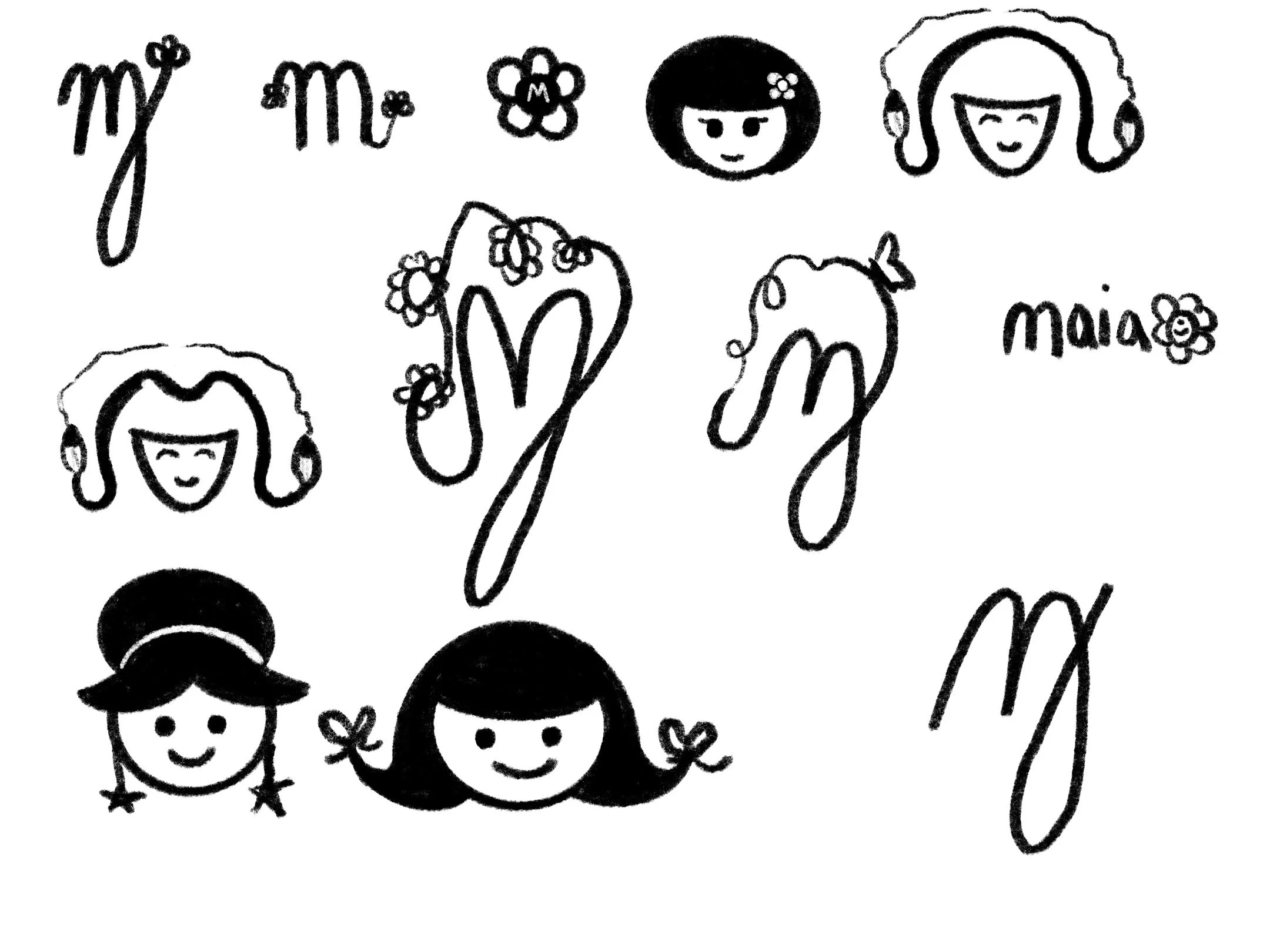
It started in the first trimester of my senior year at SCAD. My business illustration class required us to design a personal logo. I went through several rounds of sketches until I landed on one with the additional approval from my professors and peers.
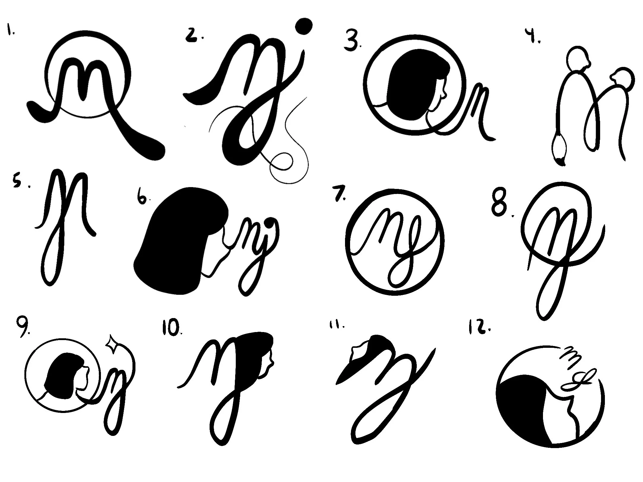
Thumbnail sketches for class
Thumbnail sketches for class
The chosen logo
In my third (and final) trimester of SCAD, I decided to color the logo a bright orange to make it really pop. My goal was to create cute illustrations with bright colors.

The orange logo

Orange logo header 1
Orange logo header 2
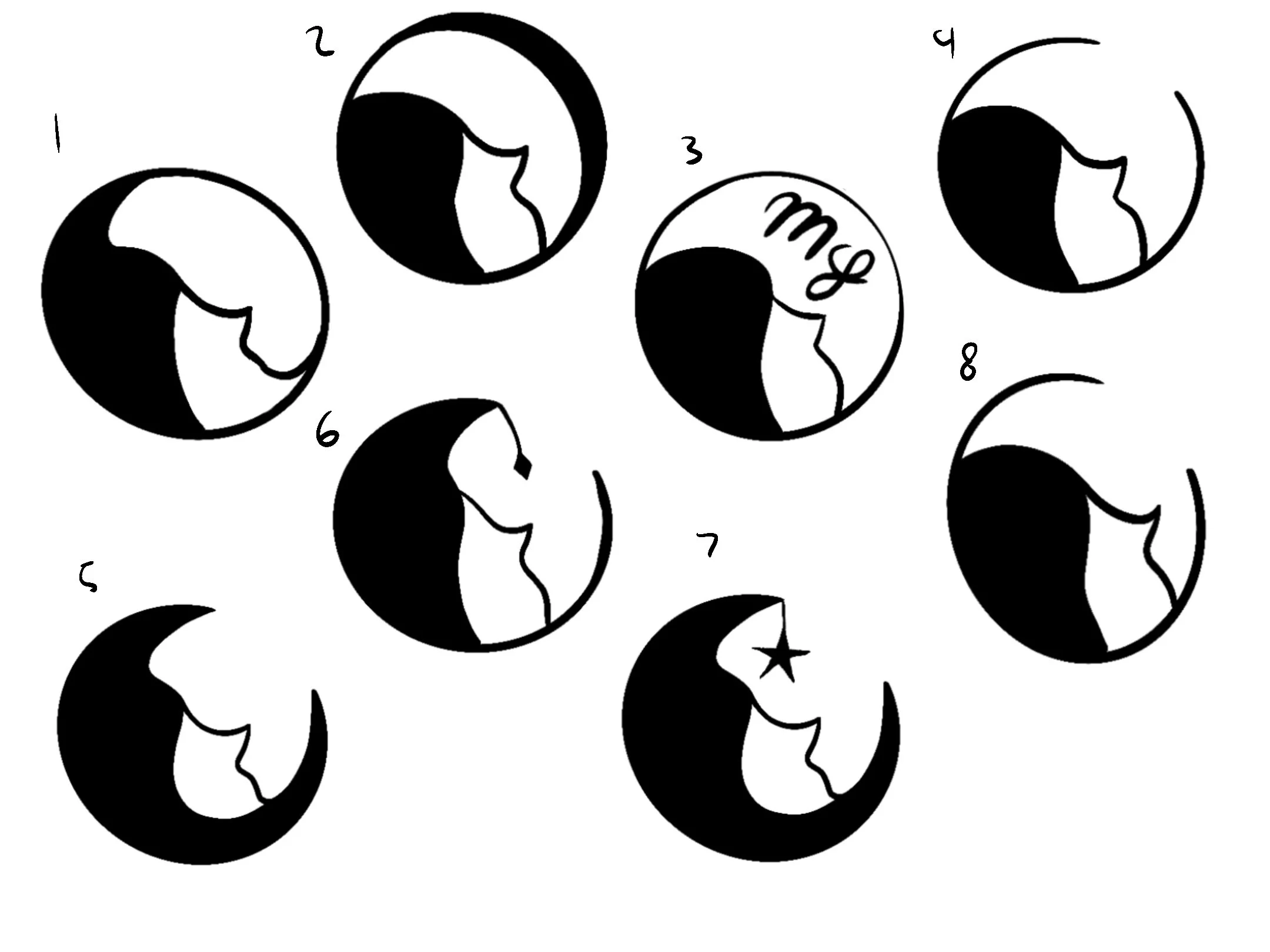
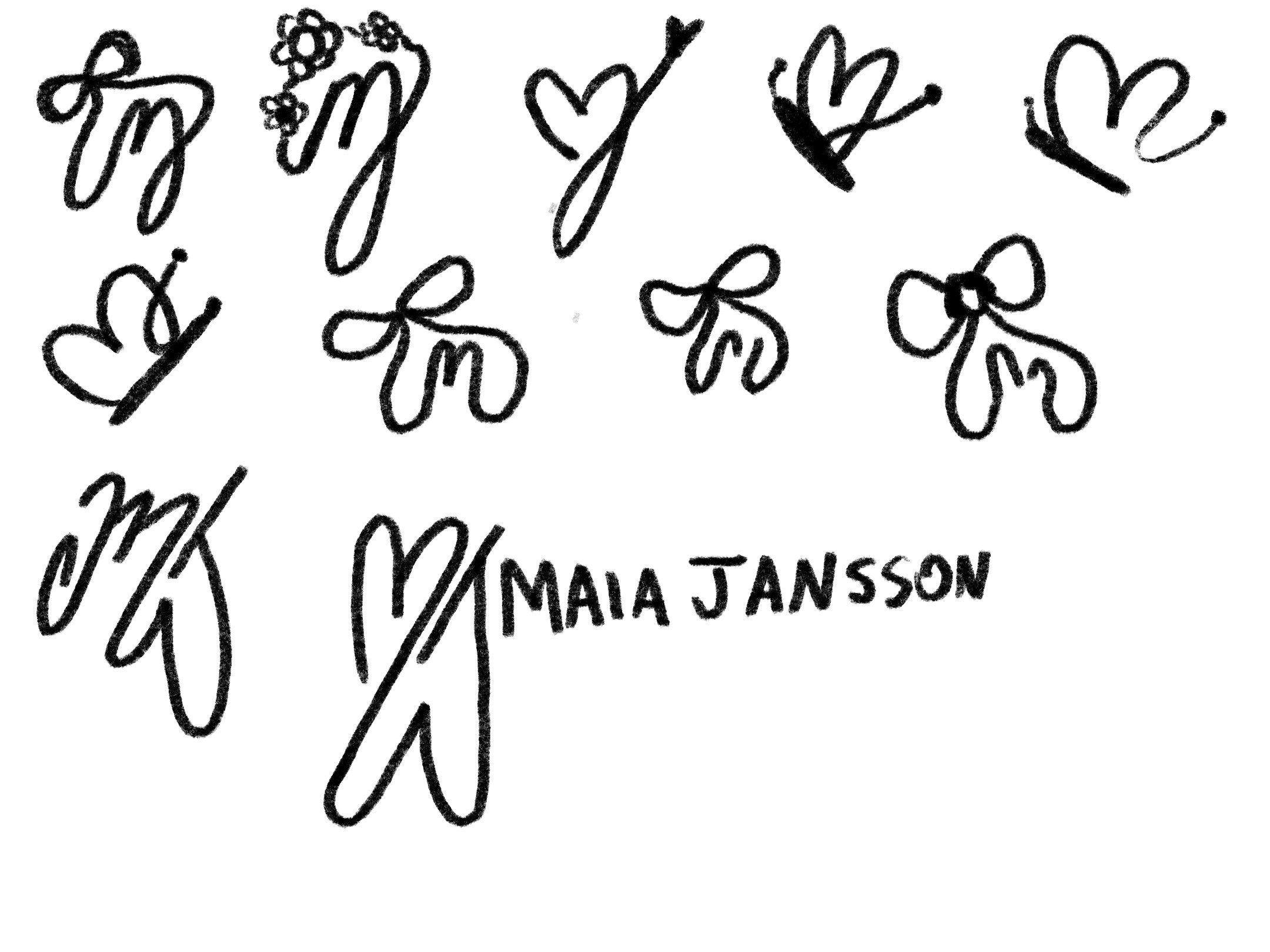
As I continued working on my portfolio post-grad, I decided I would need a logo that felt a bit more refined yet still whimsical. I went back to the drawing board and sketched out multiple concepts.
Logo thumbnails
Orange logo header 1
The final contenders
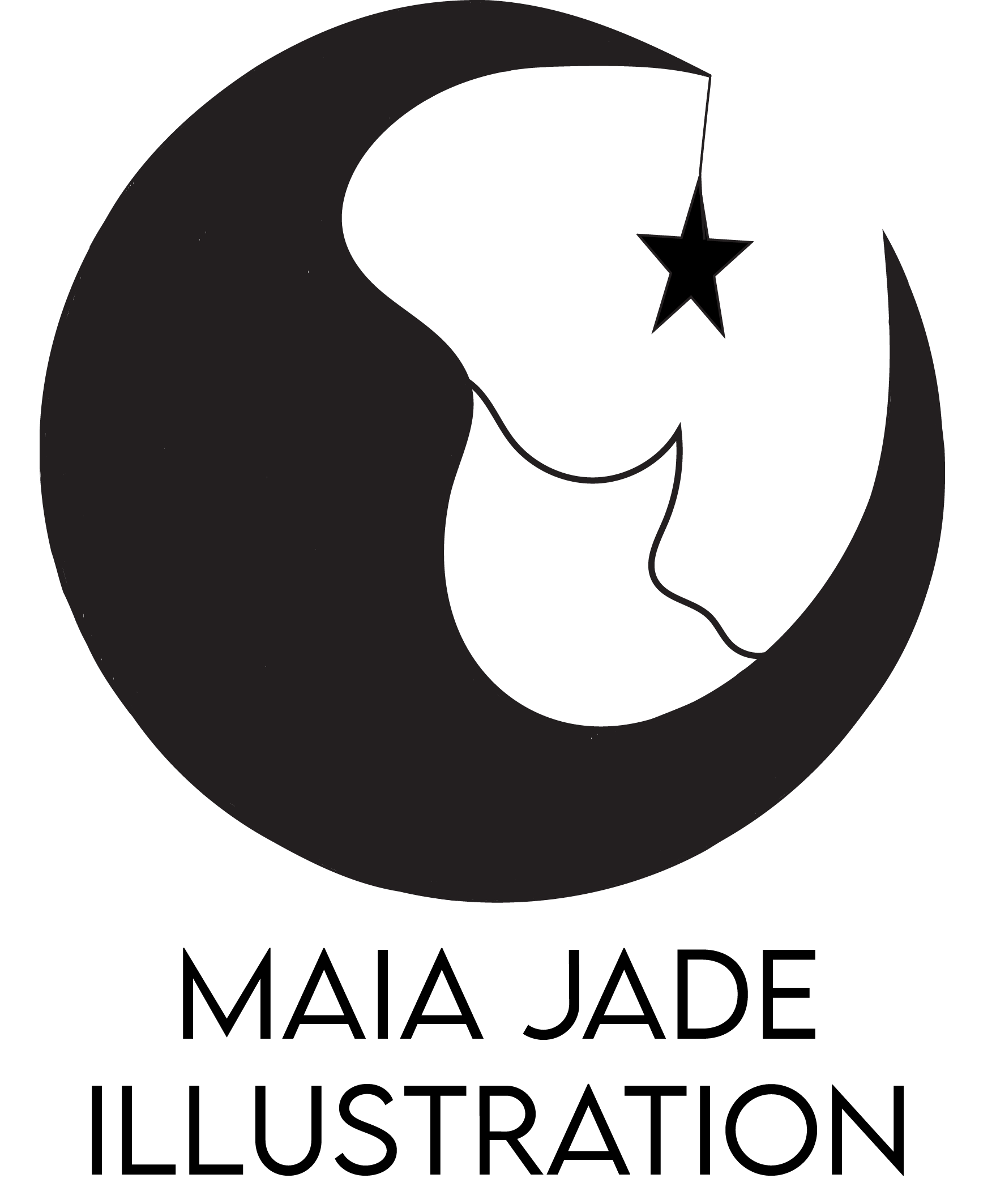
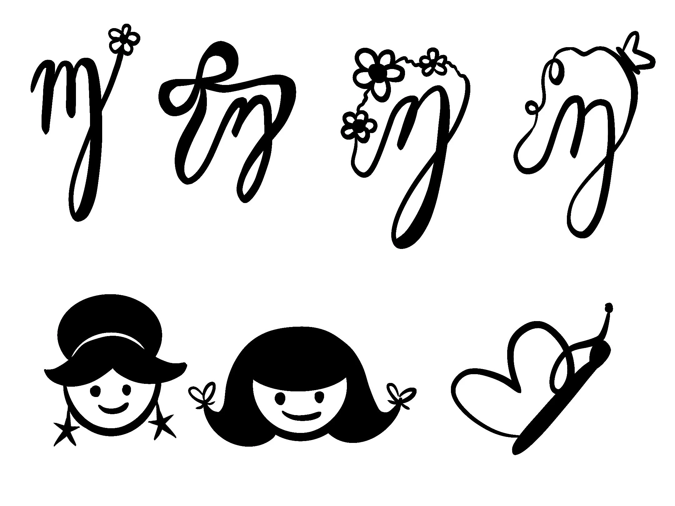
With careful consideration, I landed on the logo I have now. I designed my initials (MJ) into the wings of a butterfly. I felt it encapsulated my current identity as an illustrator and my personal preferences for illustrating organic subjects. I chose a deeper blue as it is a color I often gravitate towards in my personal fashion. While my personal branding may change in the coming years, I will always look back on this logo and my old ones with fondness.

My chosen logo