My Artistic Process
I follow a similar process that was taught by my illustration professors at SCAD: written brainstorming, research, sketches, tight sketches, value comps, color comps, and finals. I will break it down here using “Resilience” as a case study.
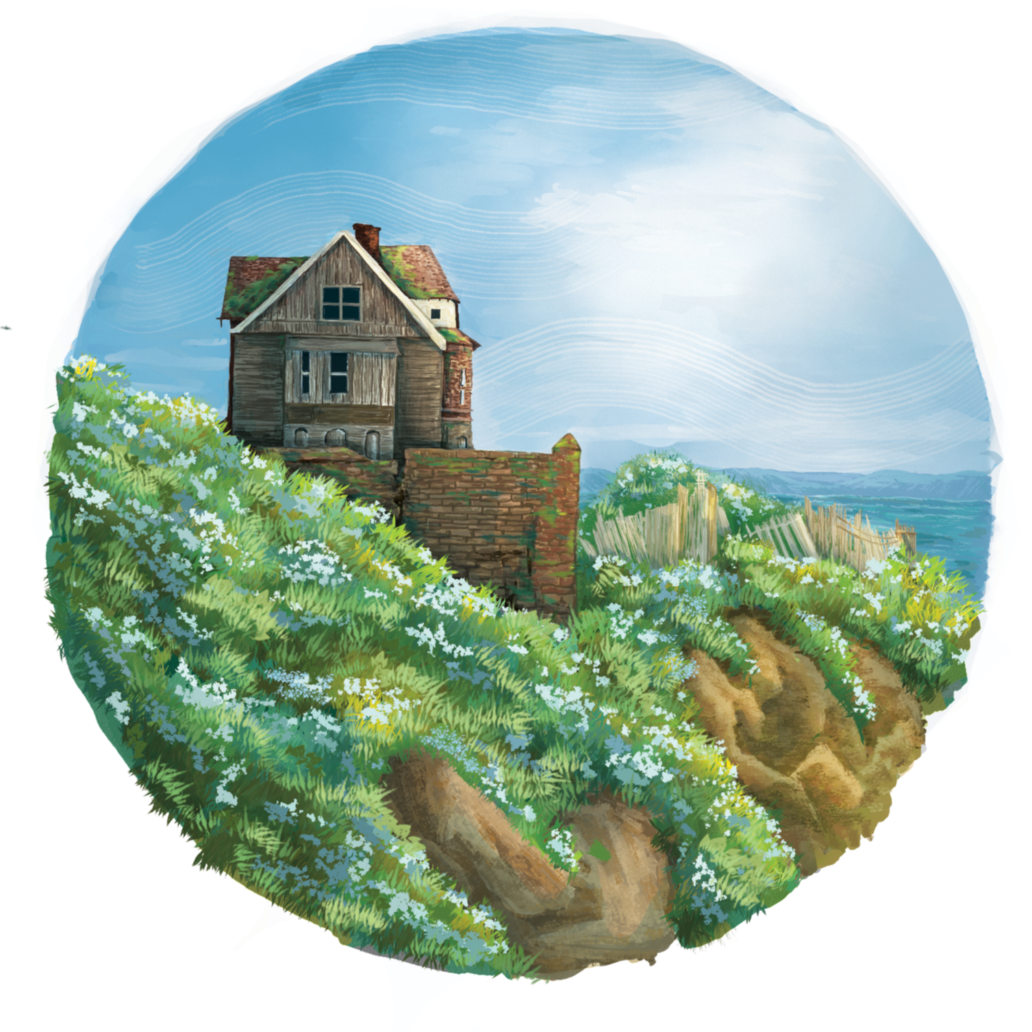
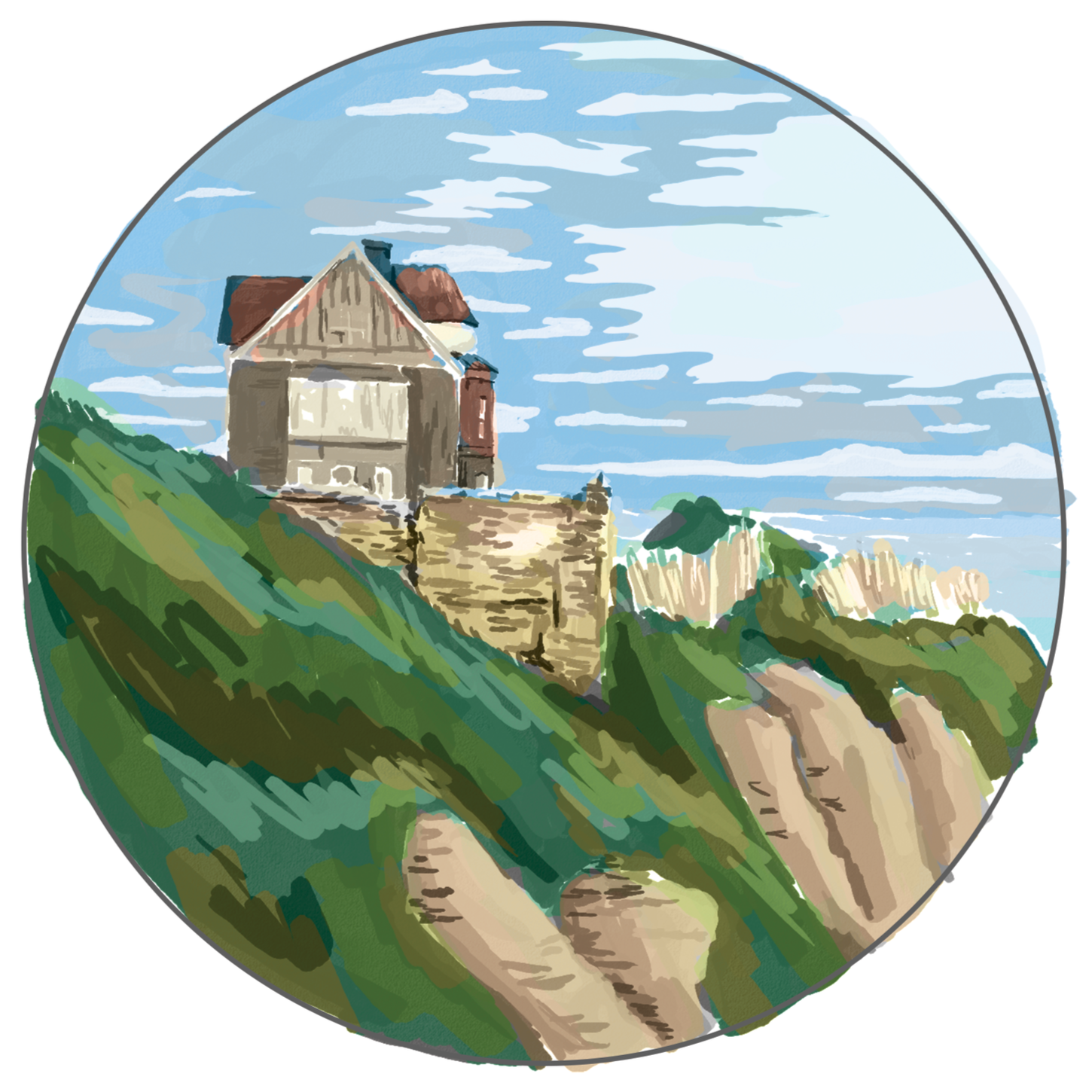
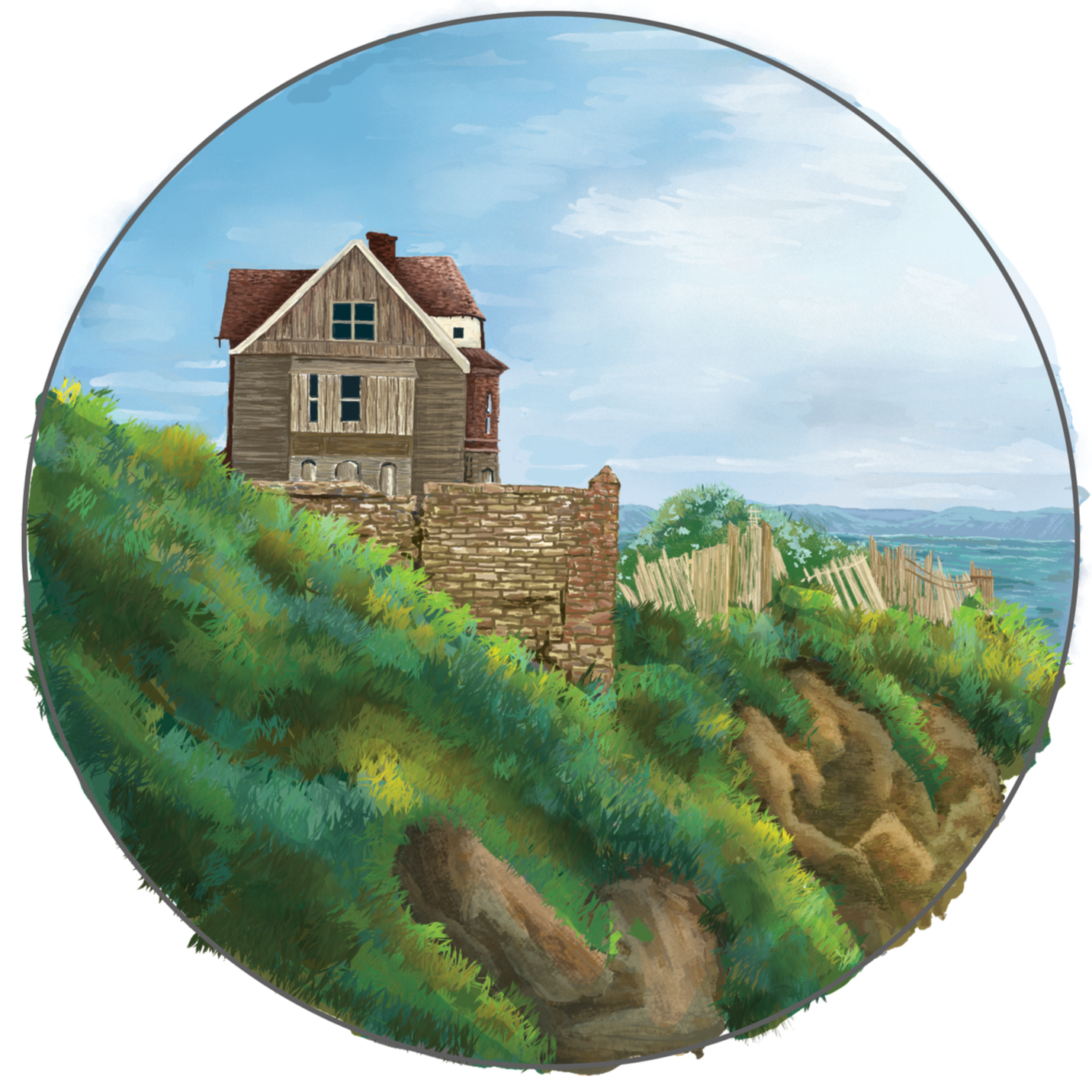
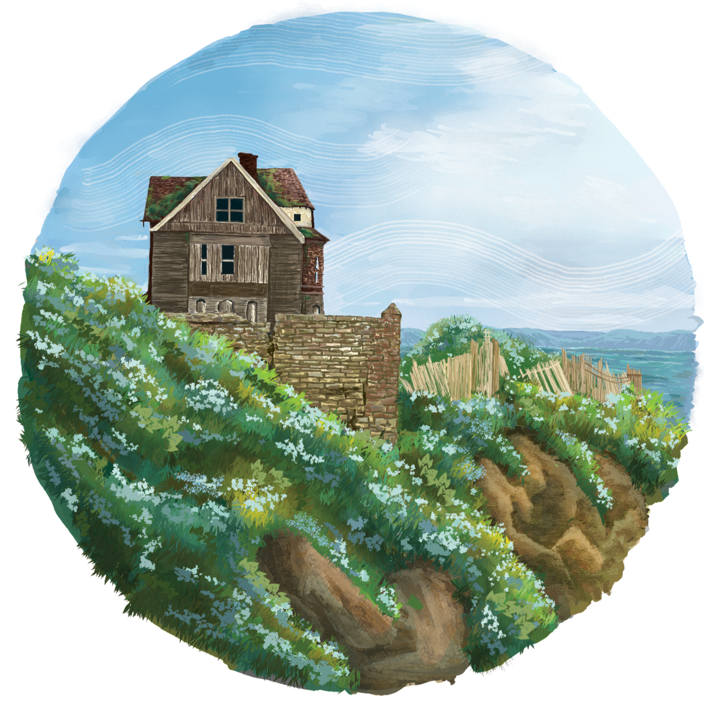
Final Illustration for “Resilience”
Communication is necessary in this field, as my choices as an illustrator and designer are dictated by the client. In this project, however, Joe gave me a good amount of artistic liberty. Before I started brainstorming, we discussed the type of spreads we wanted for each poem. We varied the types of illustrations throughout the book to add visual interest as the reader flips through the pages.
Here are the four types of spreads/ illustrations you will find in “Like a Love Song”:
Double Page Spread (also coined as “Full Bleed Spread): This illustration covers the entire two-page area and extends to the edges of the pages. The illustrator utilizes the double spread to create an immersive and detailed scene. In the case of “Like a Love Song,” doubles were allotted to poems that felt particularly meaningful or were favored by Joe and Maia.
Full Page Illustration: This is an illustration that occupies a single page, extending to its edges. It is typically just as detailed as a double spread, but only exists on a single page.
Half-Page Illustration: These illustrations take up exactly half of a single page. These can still be detailed, but the background elements may be slightly less detailed.
Spot Illustration: This is a small, standalone image that does not extend to the edges of the page. Illustrators often use spots to highlight characters, places, or objects without a full-fledged scene.
In this case, “Resilience” became a spot illustration.
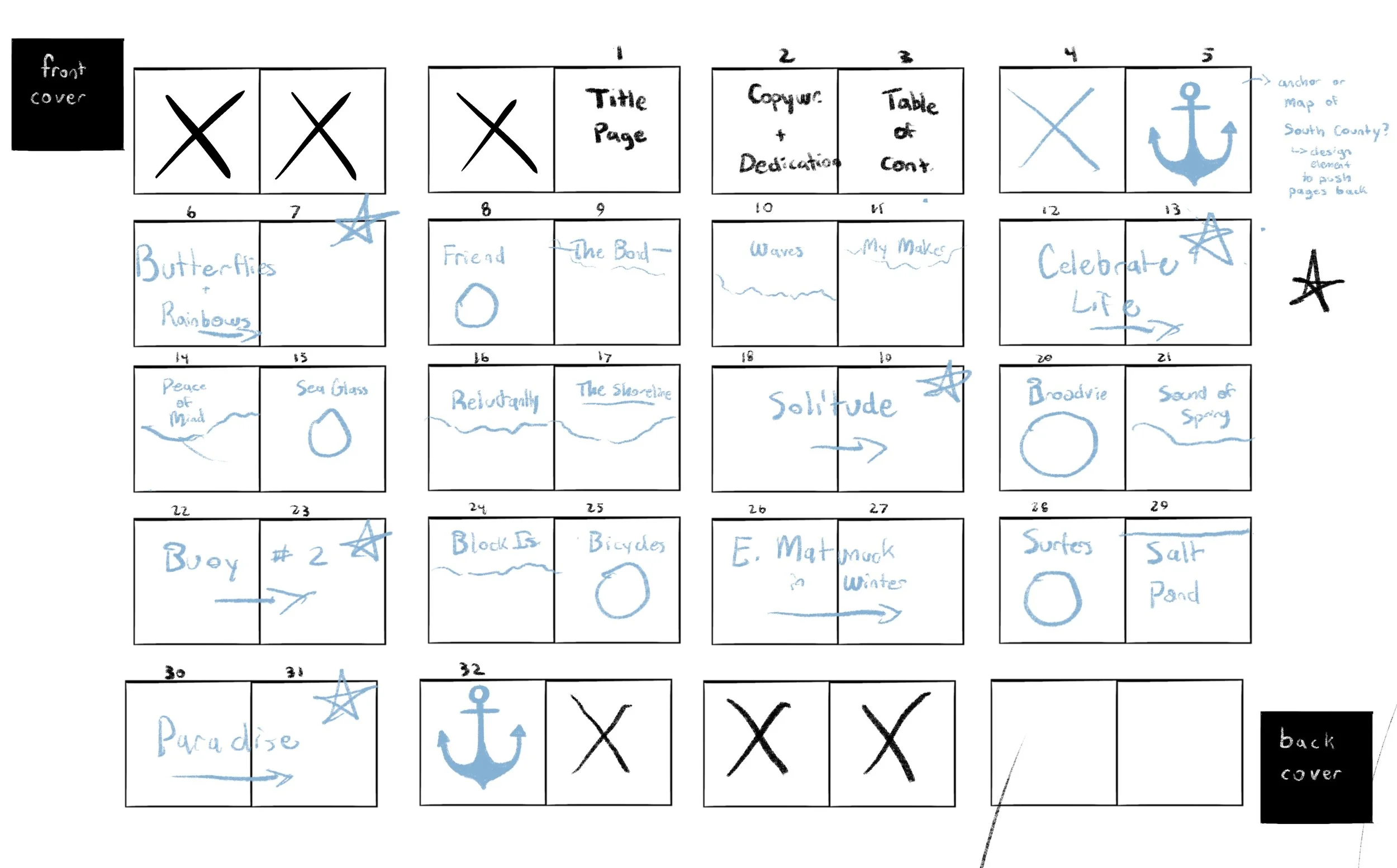
Basic Layout Storyboard with Notes
The brainstorming and research portion of this project was simplified as I had specific text to work around: The stately old mansion/ Facing wind and waves/ Proudly holding on/ Trying to save face/ It’s moss-covered roof/ And weathered clapboard skin/ Has stood the test of time/ And will do so again
I typically go over the text multiple times to pick up on subtle details, taking short notes of any images that pop up in my head. I may make small rough sketches until I feel satisfied. In the context of book illustration, I incorporate it into the storyboard. For this project, I completed each portion collectively for the sake of visual uniformity.
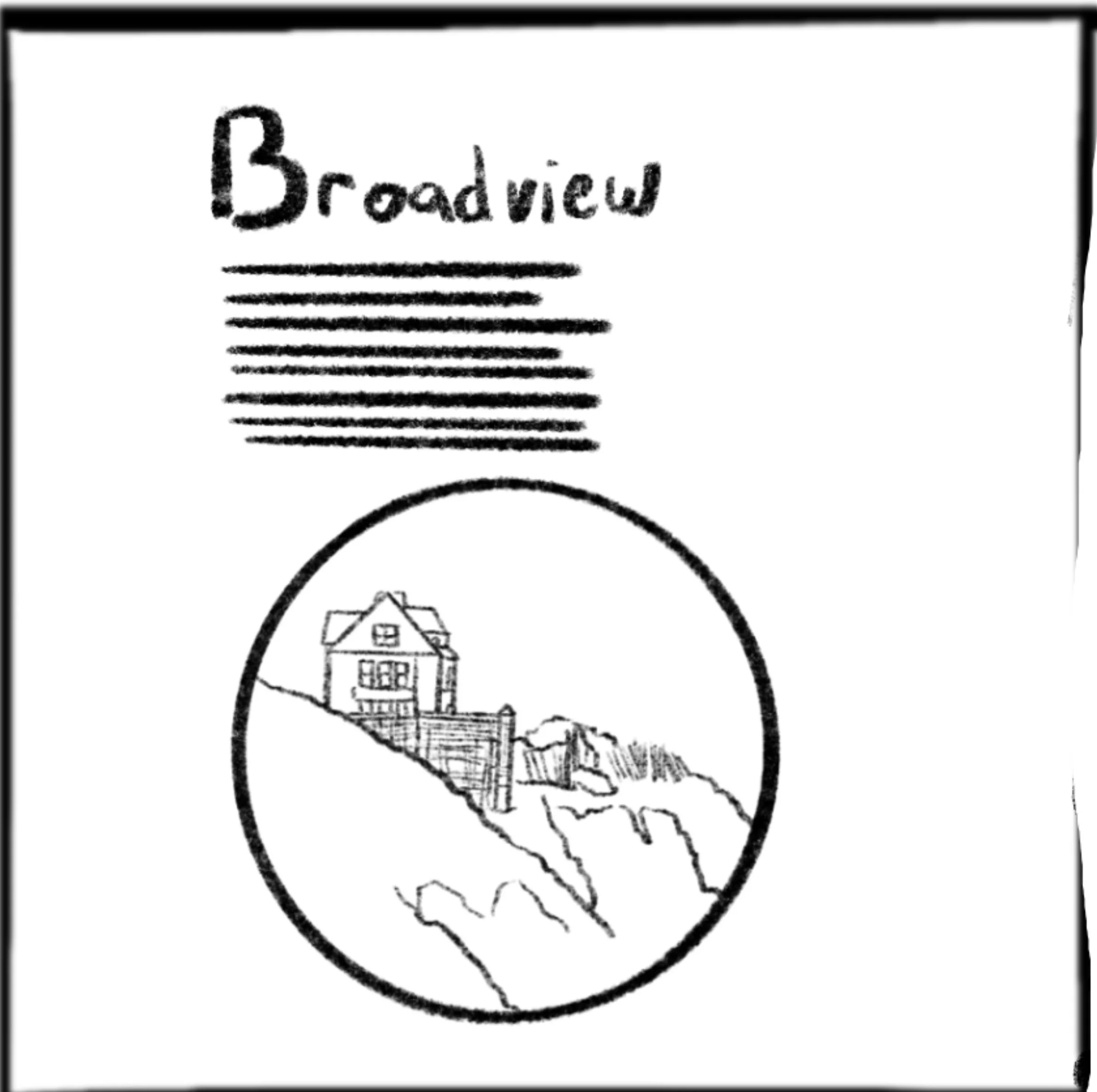
*Note: the original title of the poem was “Broadview” but was later changed.
At this point, I clean the storyboards to make the images readable for others, as this is the phase where I share work with clients, colleagues, or partners (in this case, Joe). We discussed color and detail for the final, and off I go!
As a digital artist, I typically do the first section of the work previously mentioned on my iPad using ProCreate. I switched over to Photoshop for the final.
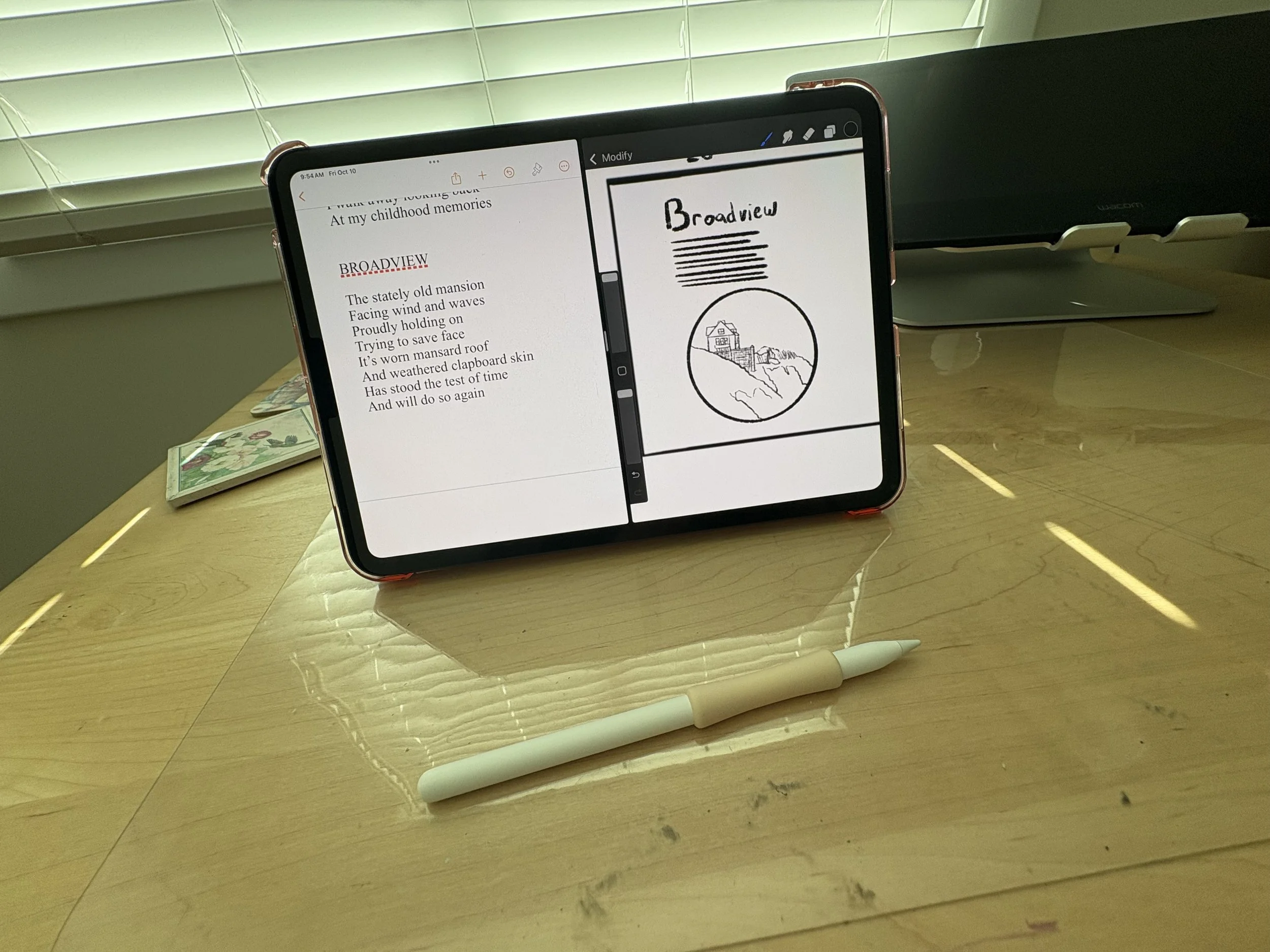
The original process work on my iPad
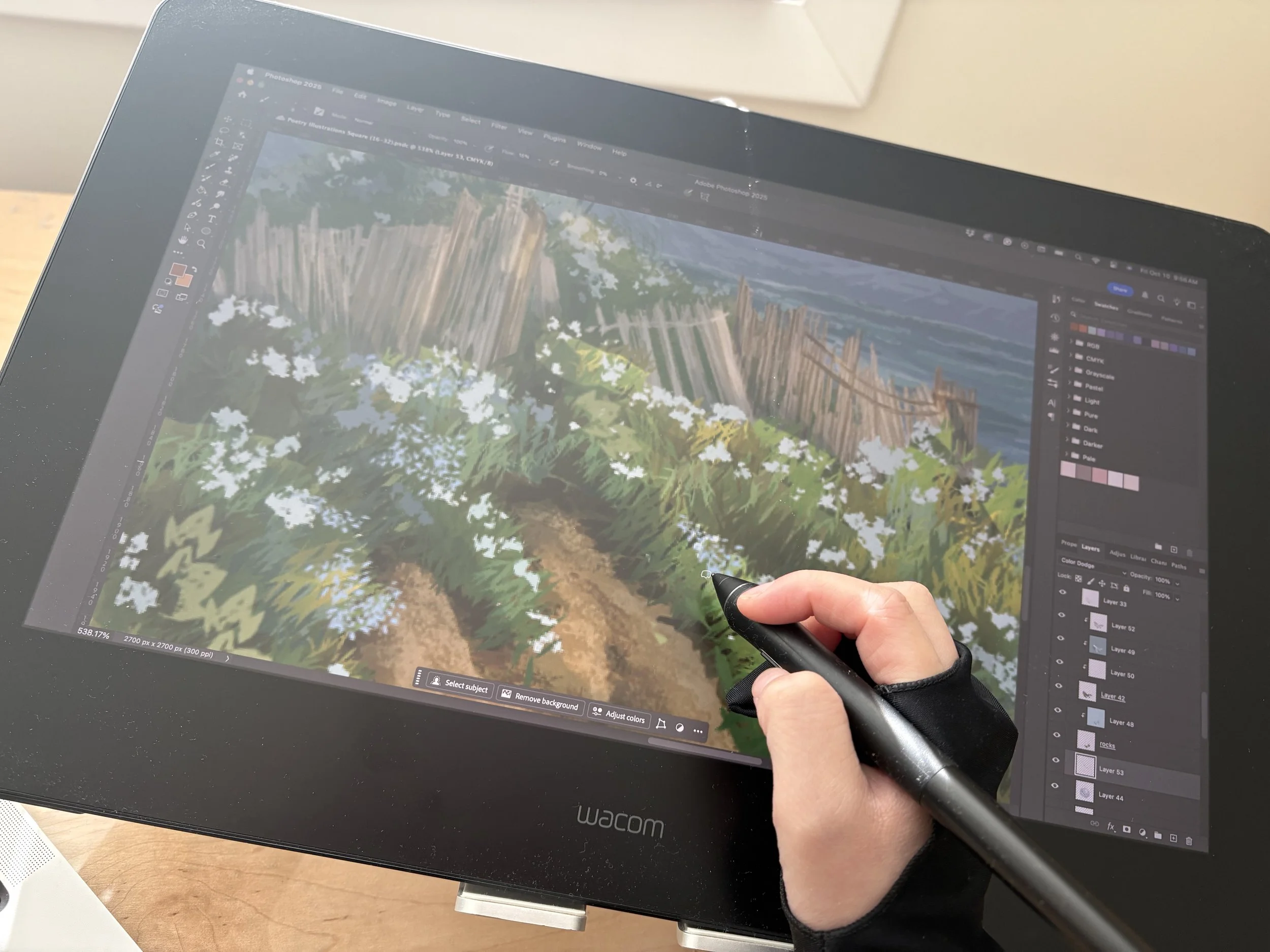
Rendering the final in Photoshop
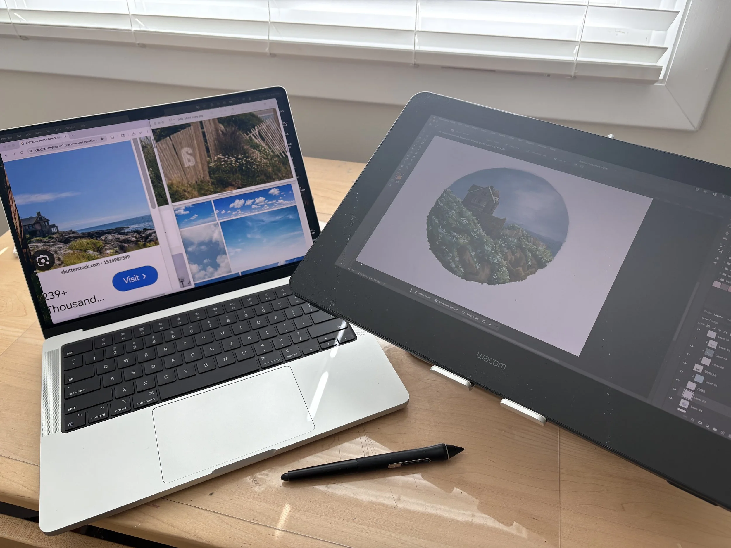
My Photoshop setup alongside my reference images
I started this illustration with a value study. In art, value is the artistic principle of light and dark. Having a clear value structure creates a sense of depth within the art. Moreover, it allows the focal point to really pop out in the final, thus simplifying my process.
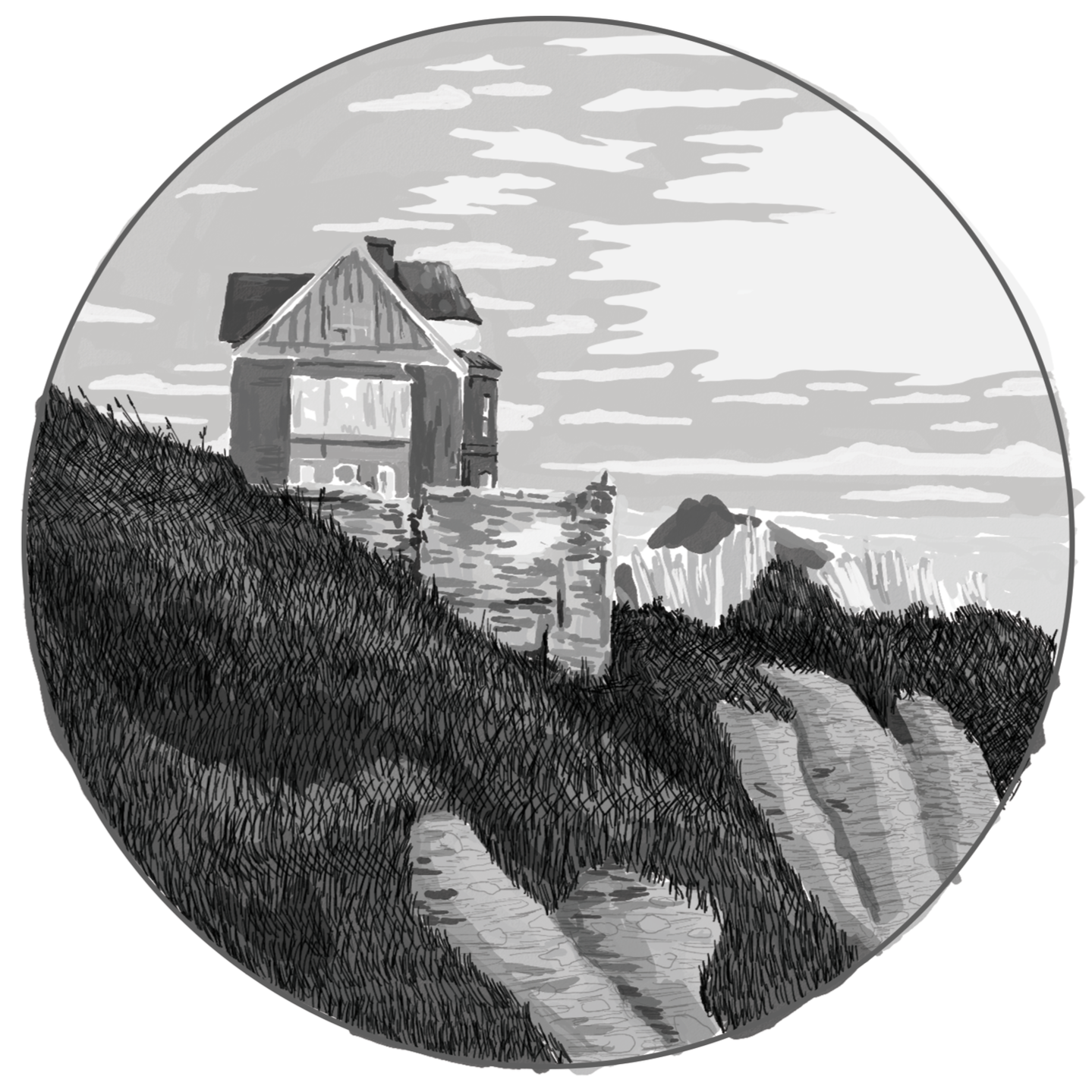
Rough value sketch
I start placing colors, using a variety of reference images throughout the process.
Rough color block-in
This is really where I play around- I try out different approaches to creating textures until I find something that feels “right.” Although the time I spend on this part often depends on the tightness of the deadline, the long-term nature of this project allowed ample room for experimenting with my rendering techniques.
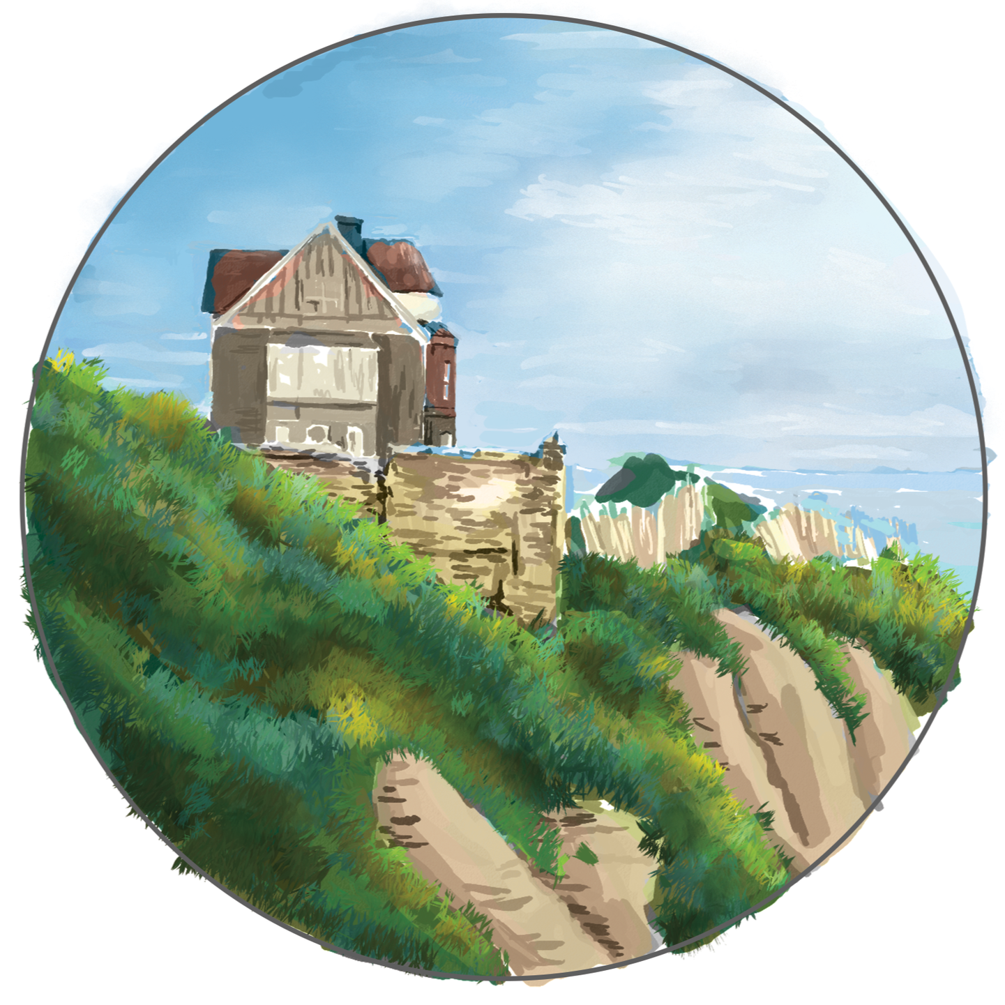
I render the clouds and start adding grass, varying the colors and hues to create depth
I block in the water, distant land, and bushes behind the battered fence
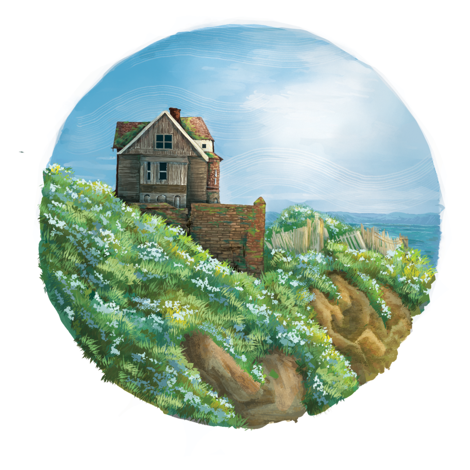
I start adding texture to the building
I add texture and details to the brick wall, fence, and cliff
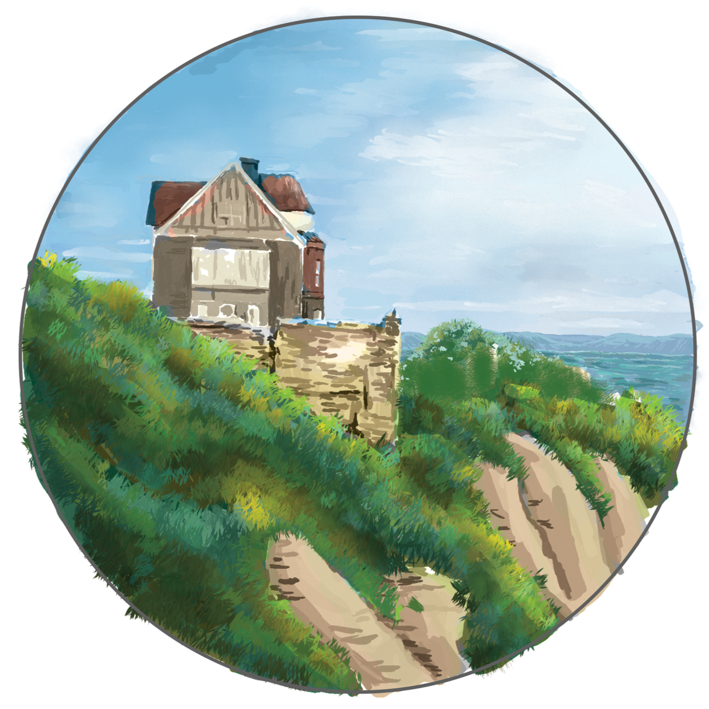
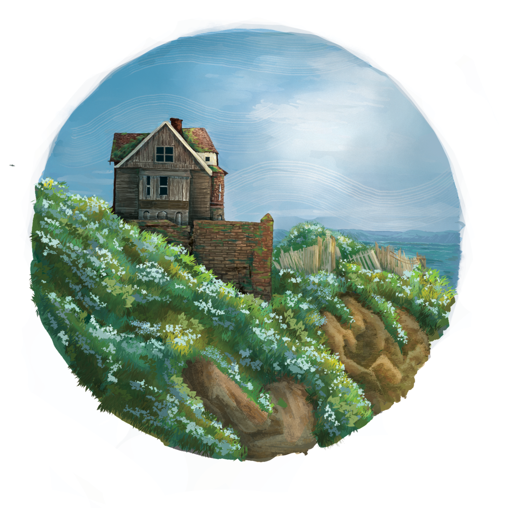
I erase the harsh circle around the illustration and add in flowers, moss, and wind details
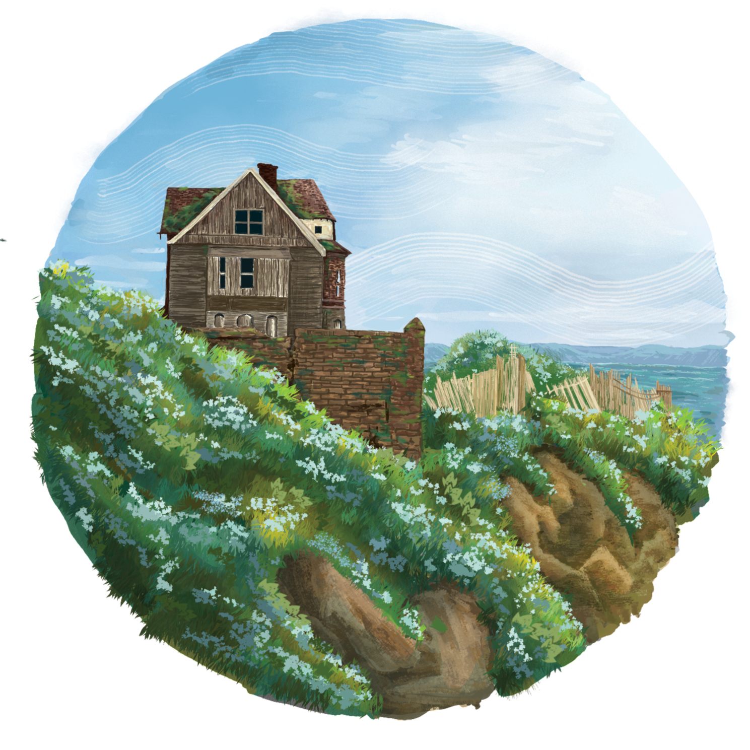
I deepen the colors of the brick wall and add in additional moss
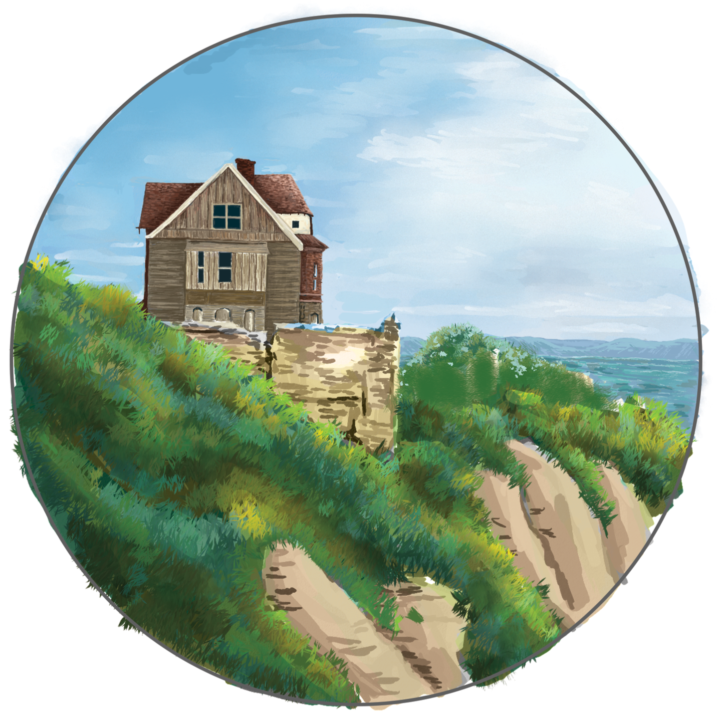
I deepened the shadows here.
Throughout the rendering process, I shared progress pictures throughout the journey to keep Joe updated. Any feedback I get is applied to the illustration. Finally, it’s complete!
After further adjusting the light and shadows, this is the final illustration!